Dropdowns represent preset series of choices made available while editing events.
For example, a set of locations or categories. There are eight dropdown fields in
each event, four of which (the userdrops) are hidden by default. Location,
category, priority and status are not hidden.
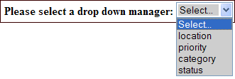
To use a particular dropdown manager select the type of dropdown you
wish to manage from the control:

Changing the order of the dropdowns
By default dropdowns are displayed in alphabetical order. You may change this
ordering by checking 'user specified' from the 'sort by' radio buttons. The up
( ) and down (
 ) icons
appear. Use these icons to change the ordering of the dropdowns. This ordering will
be apparent when the dropdowns are presented in the event edit screen. This will
also order the rows under the resource planner.
You may not delete, move nor edit the text of the first item in the list.
Coloring by category
Using the final control (source for event display data) you may enable a feature called
color by category which is described on the
referenced help file. If you enable this feature the dropdown manager shows the
various dropdowns using the display settings you specify.
Deleting dropdown items
When one deletes a dropdown item any events referencing that item are unchanged. These events will
no longer display the value (because its been deleted), however the event continues to store
the reference internally. This, so that you may undelete the dropdown value without losing the
list of events that reference it. When you compact deleted dropdowns
you will be asked how to handle the events that reference the removed dropdown values. You may
choose to delete any such events or reset their dropdown value to 'No Value'.
Data managers
 ) and down (
 ) icons
appear. Use these icons to change the ordering of the dropdowns. This ordering will
be apparent when the dropdowns are presented in the event edit screen. This will
also order the rows under the resource planner.
You may not delete, move nor edit the text of the first item in the list.